




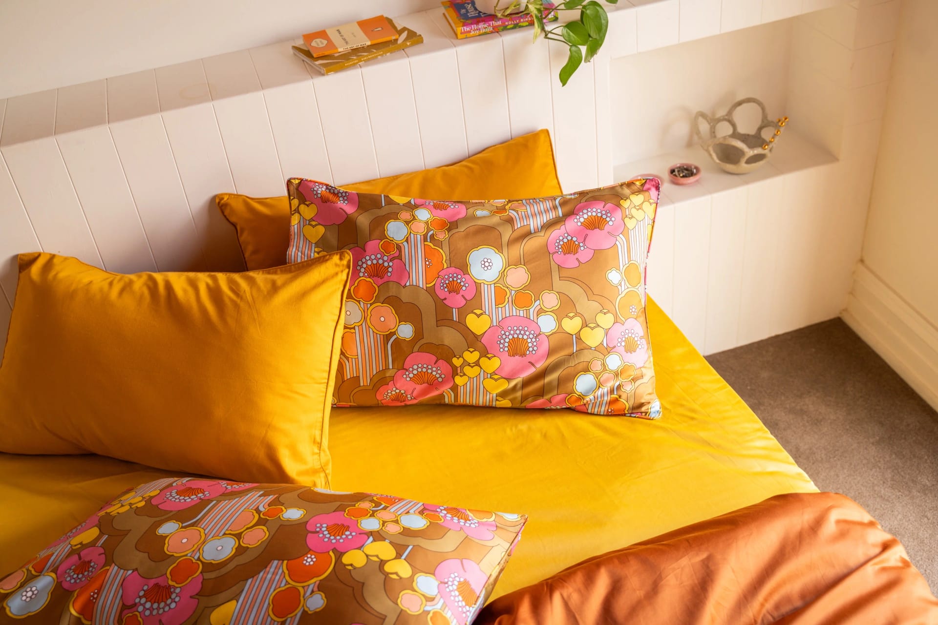

A beautiful bed is mostly a few good decisions
The beds you see in magazines are not complicated. They follow a handful of rules, and you can follow them too. These are the five we come back to on every Beddie shoot.
1. Start with a calm base
Your fitted sheet and flat sheet cover the most space, so they set the tone. A softer solid such as White, Cloud or Lilac gives you room to play with the quilt cover and pillowcases on top. Browse the plain and printed options in our cotton sheets.
2. Let one pattern lead
Two busy prints fighting for attention rarely look intentional. Choose a hero (a floral, a stripe or a retro print) and let everything else support it. Good places to start:
- Floral bed sheets and floral quilt covers for a garden-in-the-bedroom feel.
- Retro bed sheets for warm, nostalgic colour.
- Patterned sheets if you like stripes and bolder prints.
3. Pull one colour out of the print
Look closely at your hero pattern and pick one colour from it, then repeat that colour in a plain pillowcase pair or a quilt cover. That one echo is what makes a bed look put together. A Honey Mustard or Moss Green solid is an easy partner for most prints.
4. Three pillows is the magic number
Two sleeping pillows plus one decorative cushion is enough. More than that and the bed turns into a pillow fort, which is charming but not very magazine. If you like a bit of print, our Pillowcase Parlour pairs are an easy way to add it without changing the rest of the bed.
5. Leave it a little undone
A turned-back quilt, a soft fold at the foot of the bed, a slight crinkle in the linen. A bed that looks too perfect can feel stiff; a bed that looks lived-in looks inviting. Our oversized quilt cover tip gives you that relaxed drape in one step.
Put it together
If you would rather not choose piece by piece, the bundle builder lets you mix and match sheets, quilt covers and pillowcases, with 10% off three pieces and 15% off four or more. For more ideas, see our styling ideas.